Soho Home x Pierre Frey wallpaper, available from Pierre Frey
Cover Soho Home x Pierre Frey wallpaper, available from Pierre Frey

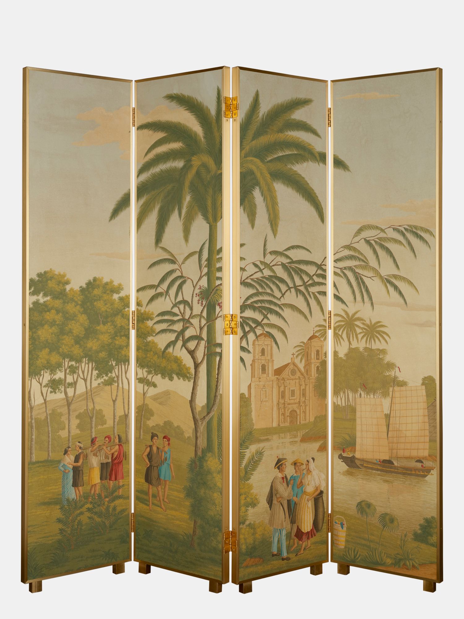
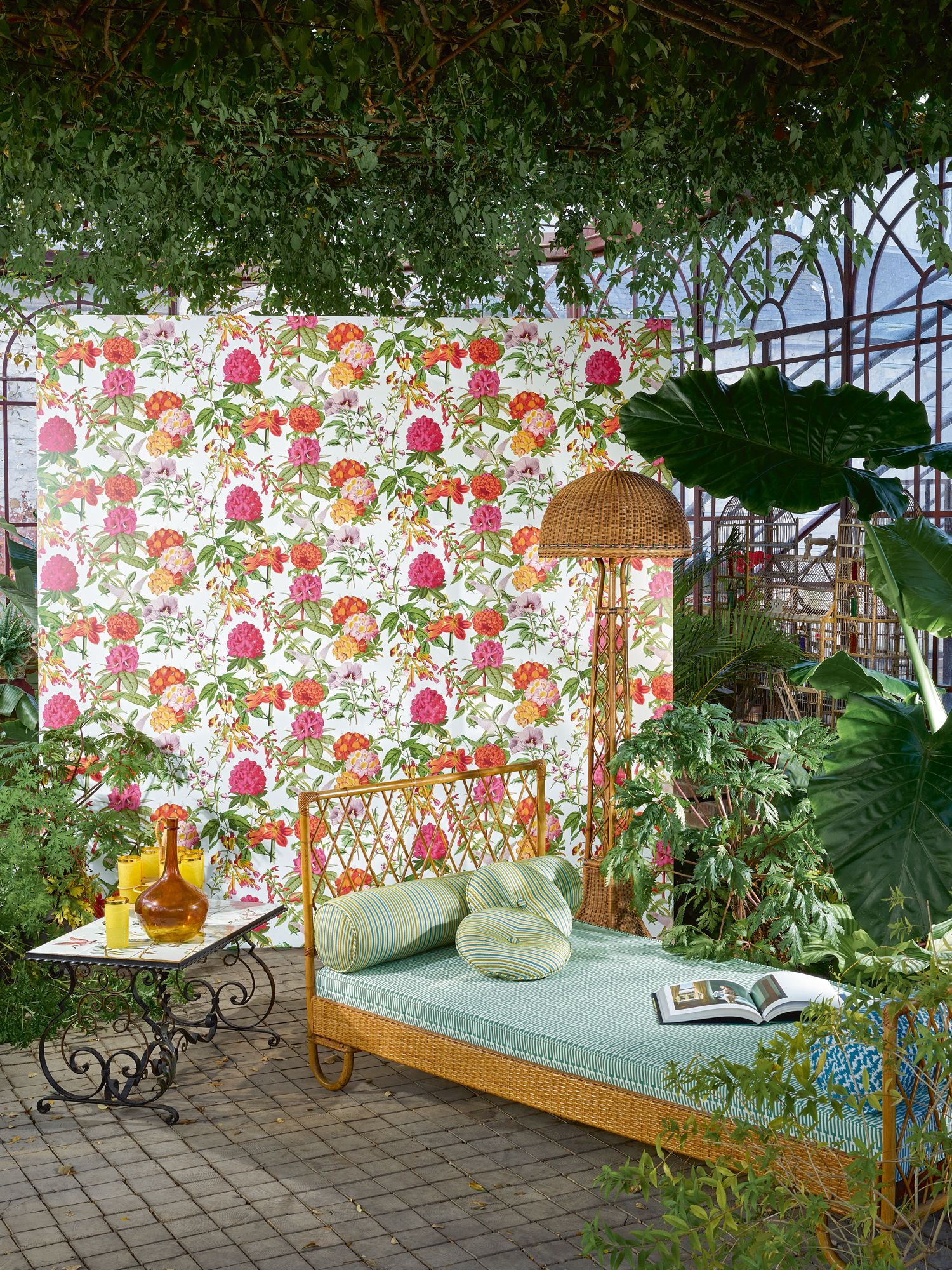
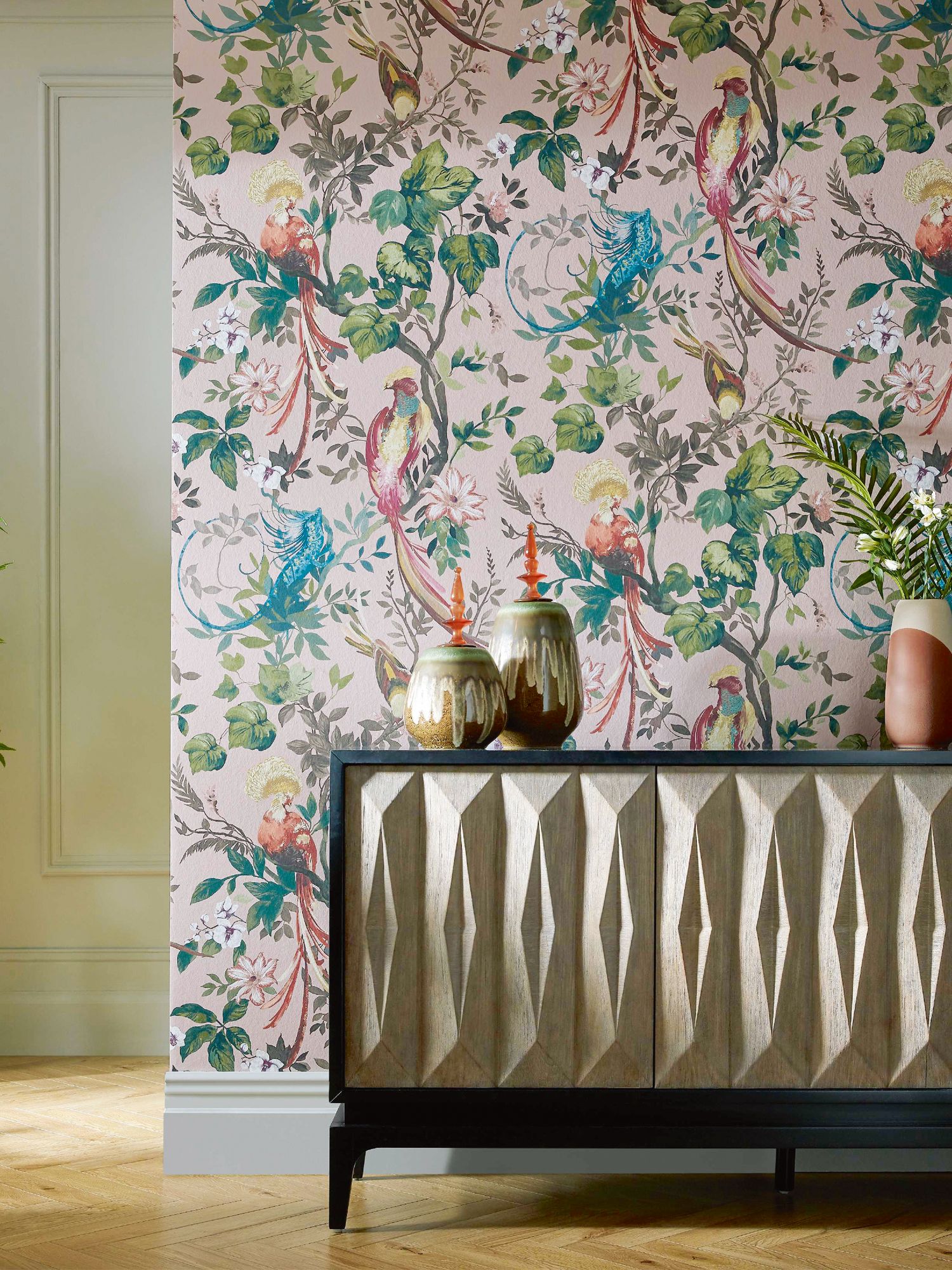
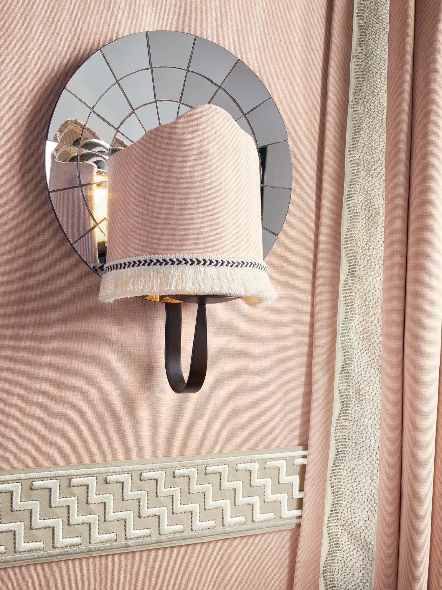
Lift your spirits—and your space—with cheerful colours, tactile materials, and vibrant patterns. Here’s the design intel on the upholstery trends to know for that home makeover

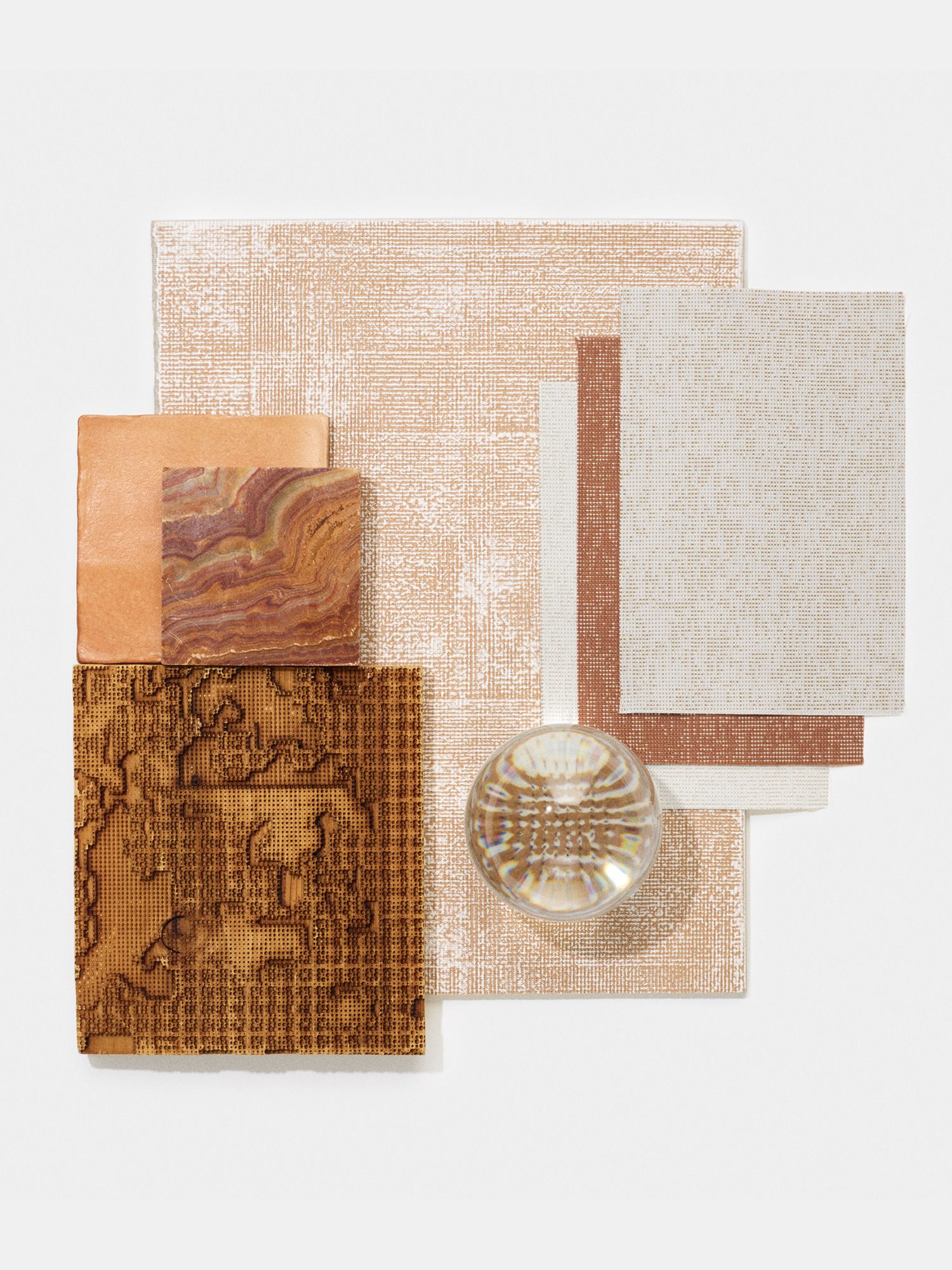
Your upholstery matters more than you think—the textile coverings can dramatically change the room in an instant and elevate the overall aesthetic. Here, we share the hottest looks and trends to keep in mind when you switch out your upholstery. Think statement colours, warm textures, and vibrant patterns. 

See also: 15 Home Design Trends to Watch in 2021
 

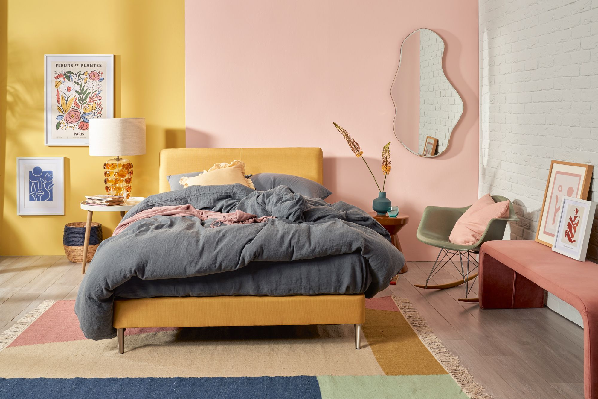
1. Colour: Hello Sunshine

arrow left arrow left
arrow right arrow right
Photo 1 of 2 Citrona, a paint colour from the California Collection by Kelly Wearstler and Farrow & Bal
Photo 2 of 2 A room in shades of grey designed by local studio EightyTwo

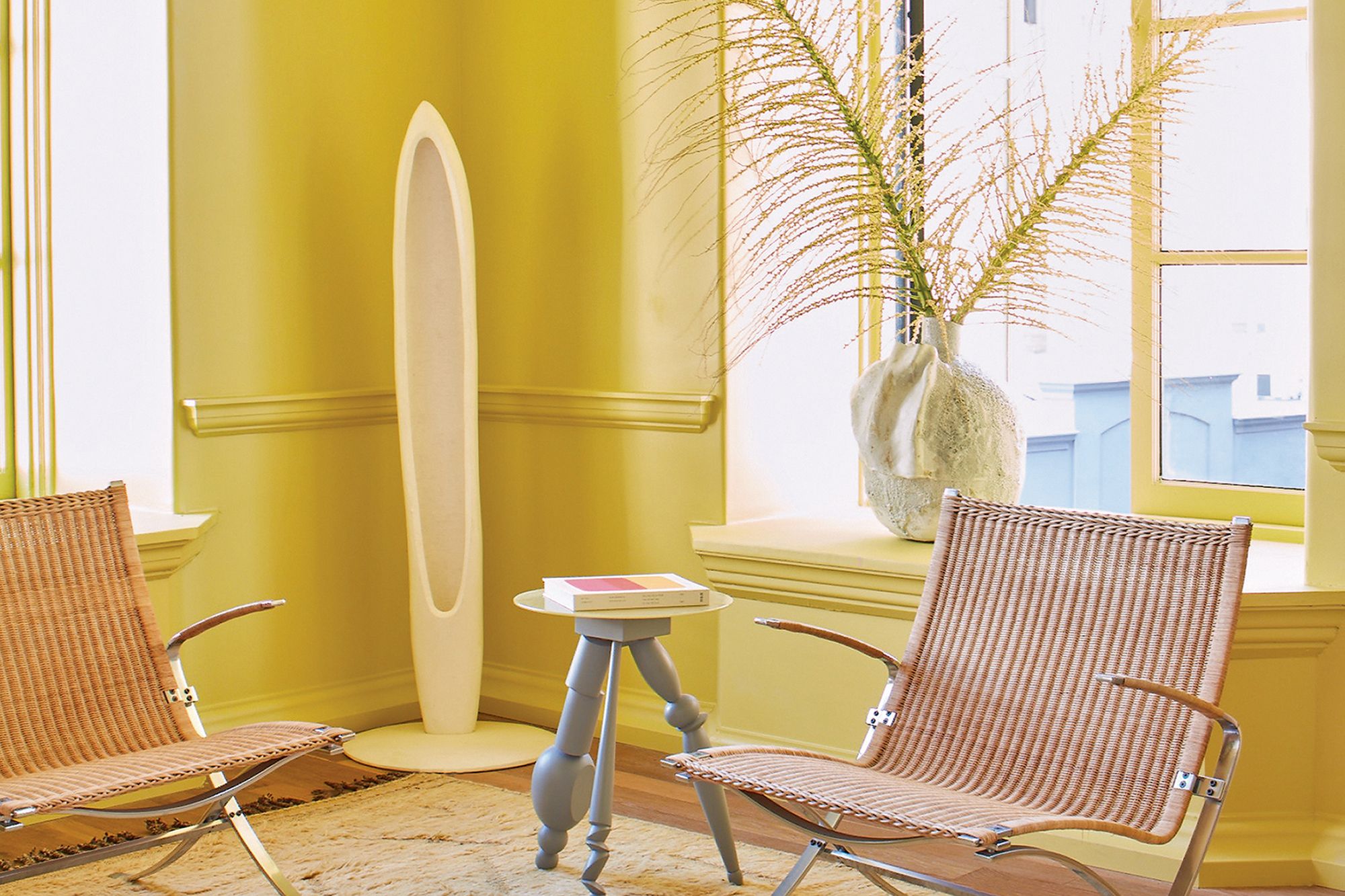
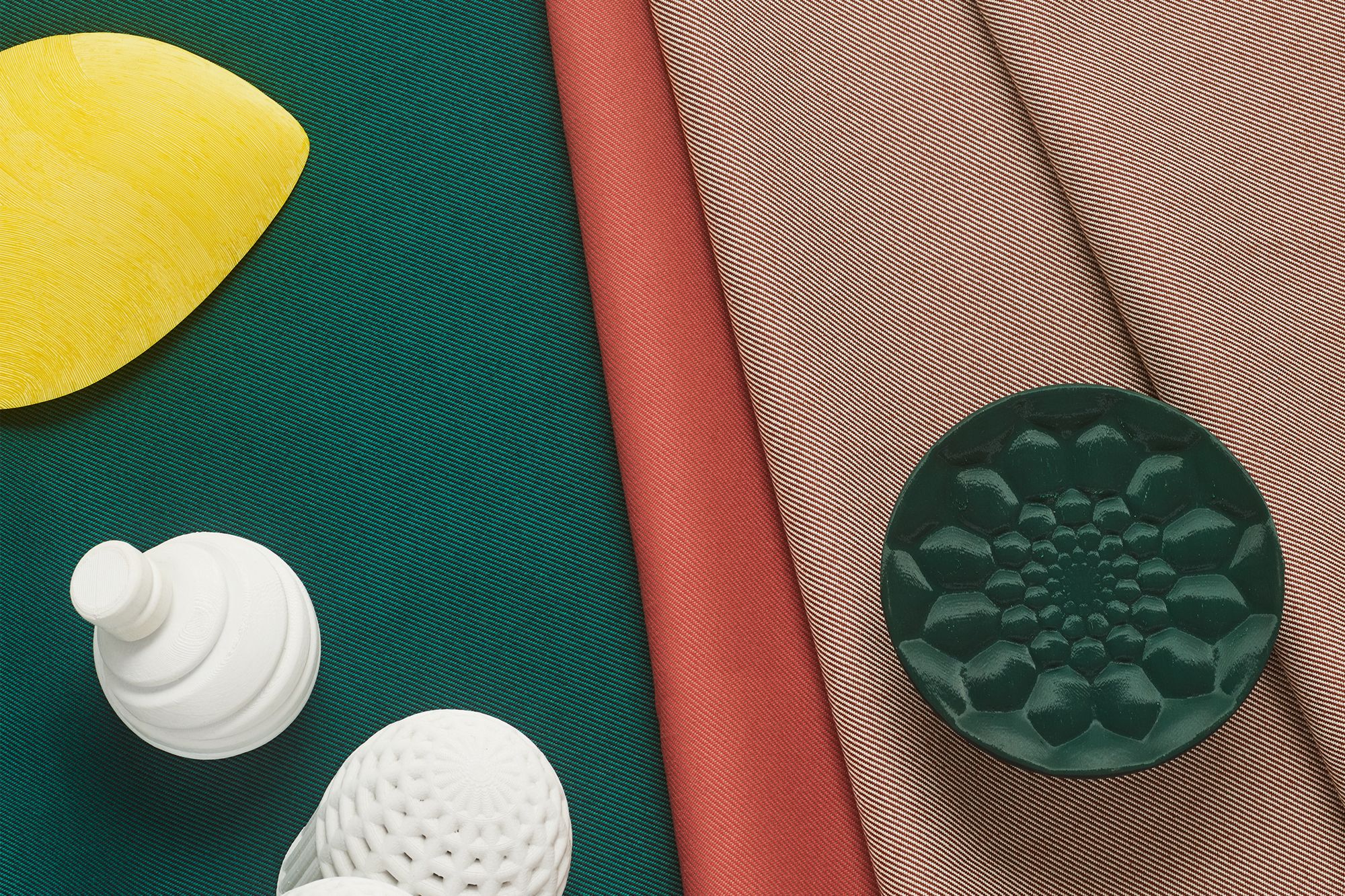
At the Pantone Color Institute, experts selected two hues to convey the prevailing trends for the year: Ultimate Gray, an understated grey shade, and Illuminating, a sunny yellow tone, to express the duality of contemplation and optimism. Laurie Pressman, vice-president of the Pantone Color Institute, believes that the combination of these two hues communicates versatility and creative freedom.

“We could not help but acknowledge the highly unusual time we found ourselves living in,” says Pressman. “The selection of two independent colours highlights how different elements come together to express a message of strength and hopefulness that is both enduring and uplifting.”

See also: 17 Ways To Decorate With The Pantone Colour of the Year 2021
 

arrow left arrow left
arrow right arrow right
Photo 1 of 2 J.Marshall by Vispring bed in Barcelona Sol fabric, from Luxury Mattress Collection
Photo 2 of 2 Kvadrat’s Atrium Outdoor upholstery collection by Patricia Urquiola features a bright yellow shade and other warm hues on weatherproof fabrics

The yellow hue is intended as an accent shade, while the grey tone serves as a calming primary tone. For instance, yellow cabinetry can liven up a contemporary kitchen with stainless steel appliances. In the living room, the grey hue can be applied as wall paint to further accentuate colourful furnishings. The popularity of this yellow tone also echoes the general regard for vibrant hues.

“What we see at the moment in fashion are very rich and bright colours, big graphic patterns and structured textiles,” says Njusja de Gier, senior vice-president of marketing at Danish textile company Kvadrat.

2. Textile: Natural beauty

Tatler Asia
A bedroom dressed in upholstery textiles and wallpaper from Pierre Frey’s Natecru collection
Above A bedroom dressed in upholstery textiles and wallpaper from Pierre Frey’s Natecru collection
Tatler Asia
A sofa and accent cushions upholstered in fabrics from the Élitis Pur Lin upholstery collection
Above A sofa and accent cushions upholstered in fabrics from the Élitis Pur Lin upholstery collection

“When you include natural, woven textiles, spaces immediately become more inviting and cosy,” says Hong Kong-based designer Rowena Gonzales of Liquid Interiors. This is evident in the spaces she designs, which are beautifully layered with a mix of fabrics and rugs. More homeowners and designers alike are choosing eco-conscious fabrics, such as those from Pierre Frey’s Natecru collection.

Made with sustainably sourced organic cotton, locally produced wool and linen, as well as recycled polyester and cashmere, the Natecru fabrics imbue interiors with a rustic touch. “The rough-hewn irregularities in these woven fabrics mimic the beautiful imperfections of nature,” says Matthieu Frey, Pierre Frey’s Asia Pacific director. He suggests using such fabrics as heavy draperies, wool throws or cushion covers in a variety of weaves, textures and patterns.

Tatler Asia
Textural bedlinen and wooden furnishings contribute to the cosy ambience of a bedroom designed by Liquid Interiors
Above Textural bedlinen and wooden furnishings contribute to the cosy ambience of a bedroom designed by Liquid Interiors

Adds Ludovic Darricau, managing director of the Asian branch of French fabrics firm Élitis: “We have always been committed to creating rich, structured fabrics. The complexity of the weave and the multiple heavy materials used in the weft allow us to create such textures, which are now in demand. In Asia, when air-conditioned rooms sometimes feel a little chilly, heavy-weft fabrics are perfect as sofa upholstery, throws or cushion covers.”

See also: Beat The Heat: 5 Stylish Ways To Stay Cool At Home
 

3. Material: Think green

Tatler Asia
Kvadrat’s Reflect and Relate upholstery fabrics are used on furnishings from Molteni&C
Above Kvadrat’s Reflect and Relate upholstery fabrics are used on furnishings from Molteni&C

One silver lining of the pandemic is the heightened emphasis on sustainable design. Eco-conscious and energy-efficient production methods have already been on the rise, as more upholstery brands utilise greener alternatives in their production processes. “Circular design is about designing waste out of the system; our textile engineers are constantly sourcing for new materials and techniques to help us produce with the lowest possible impact on the environment,” says de Gier.

Such examples include Kvadrat’s Braid collection of rugs by Dutch designer Karin An Rijlaarsdam, which draws inspiration from craft techniques while minimising plastic waste. Available in eight hues, 88 per cent of each rug is crafted with recycled polyester derived from post-consumer plastic, braided as intertwining ropes to create a tactile look.

Tatler Asia
Kvadrat Braid rug by Karin An Rijlaarsdam
Above Kvadrat Braid rug by Karin An Rijlaarsdam

Other examples include Kvadrat’s Relate and Reflect textiles by Patricia Urquiola, used on furnishings for Italian brand Molteni&C. Relate is a fire-retardant textile designed for hospitality projects, while the Reflect fabric is made of a Trevira CS yarn derived from recycled PET bottles collected in Thailand; this material is also used in Kvadrat’s Atrium Outdoor upholstery collection by Urquiola.

See also: How to be More Eco-Friendly in Singapore? Swap Everyday Items With Sustainable Options

4. Pattern: Asian influences

Tatler Asia
De Gournay x Kelly Hoppen Kumu wallpaper, from degournay.com
Above De Gournay x Kelly Hoppen Kumu wallpaper, from degournay.com
Tatler Asia
Kanagawa wallpaper from the Nobilis Diapason collection, available from Cetec
Above Kanagawa wallpaper from the Nobilis Diapason collection, available from Cetec

In the past, brightly coloured chinoiserie designs tended to dominate when it came to incorporating Eastern influences in an interior scheme. This European interpretation of Asian elements was first popularised in the 18th century, and while it still holds some sway, the trend now leans towards more subtle nods to its Eastern influences with the use of patterns that look strikingly modern, yet are rooted in history.

Some examples include Japanese motifs such as the seigaiha, a concentric pattern inspired by ocean waves which first appeared in the sixth century, as well as fan-shaped forms and nature-inspired elements typically found on traditional kimono fabrics.

5. Inspiration: Embracing Wanderlust

Tatler Asia
Soho Home x Pierre Frey wallpaper, available from Pierre Frey
Above Soho Home x Pierre Frey wallpaper, available from Pierre Frey

As leisure travel came to a standstill, designers turned to murals that depicted exotic locales to channel a holiday mood. “When you’re unable to leave your home, the benefits of a transportive vista become very appealing,” says Hannah Cecil Gurney, director of British wallpaper brand De Gournay. She adds that the brand’s hand-painted panoramic wallcoverings work well in hallways and small spaces. “We’re seeing our scenic designs used in powder rooms and bars,” she says.

James JJ Acuña, creative director of Hong Kong and Manila-based firm JJ Acuna / Bespoke Studio, recently used De Gournay’s Latina Manila wallpaper in a home in the Philippines. “These murals give a sense of adventure to any space,” he says.

Tatler Asia
Cole & Son Verrio Sky wallpaper from the Historic Royal Palaces - Great Masters collection, available from Goodrich Global
Above Cole & Son Verrio Sky wallpaper from the Historic Royal Palaces - Great Masters collection, available from Goodrich Global
Tatler Asia
De Gournay Latina Manila wallpaper installed on a screen, available from degournay.com
Above De Gournay Latina Manila wallpaper installed on a screen, available from degournay.com

According to Terence Neo, founder of local studio EightyTwo, scenic murals can even work well on ceilings. He adds that it’s important to ensure a cohesive aesthetic. “Since the mural will likely be a room’s focal point, the rest of the furniture should be minimalist. Keep in mind how much natural light shines into the room; consider the mood created by the presence or absence of light,” he says.

“Exotic wall murals are a lot like artwork, so choose wisely and select images that aren’t too visually bewildering because the home should always be a place of relaxation and calm,” says Gonzales. She has used mural walls in children’s bedrooms as she believes these foster creativity and imagination.

See also: 8 of the Most Beautiful Museums in Asia
 

6. Pattern: Botanic mix

Tatler Asia
ADO Goldkante Palila upholstery fabric from the Be Unique Spring 2021 collection (used as curtains in a bathroom), available from Cetec
Above ADO Goldkante Palila upholstery fabric from the Be Unique Spring 2021 collection (used as curtains in a bathroom), available from Cetec
Tatler Asia
Les Rosages wallpaper, available at Pierre Frey
Above Les Rosages wallpaper, available at Pierre Frey

The Bloomsbury Group were a community of artists living in London’s Bloomsbury district who rebelled against the staid aesthetic conventions of Edwardian England with daring literature and nature-inspired art. Colourful floral and botanical prints are common motifs in Bloomsbury-style fabrics and wallpapers, and this year they’re all the rage as homeowners seek to connect with nature through their furnishings.

The Bird Sonnet wallpaper from 1838 Wallcoverings and curtain and upholstery fabrics from Travers are great ways to bring the magic of the natural world indoors. “Pandemic restrictions have made us more appreciative of the beauty of Mother Nature and Bloomsbury-inspired patterns provide a much-needed dose of escapism from excessive time spent indoors,” says Victoria Cheung, sales and marketing manager for Altfield Interiors.

Tatler Asia
1838 Wallcoverings Bird Sonnet wallpaper, available at Altfield Interiors
Above 1838 Wallcoverings Bird Sonnet wallpaper, available at Altfield Interiors

Winnie Heimgartner-Wong, managing director of Cetec, agrees. “People understand the benefits that nature-inspired elements can bring us: a soothing and homey atmosphere,” she says. She advises that the patterned wallpaper you choose should match the overall theme of your home, and to use fabrics in complementary tones.

In terms of pattern placement, Cheung suggests using these vibrant wallcoverings to create a striking feature wall in an entrance foyer, bedroom, or a snug reading nook. She also suggests framing a separate piece of the wallpaper and hanging it as an artwork. “A little goes a long way. Your eye will be drawn to a focused area; think of feature wallpaper as that final cherry on the cake,” she says.

See also: Home Tour: An Art Deco-Inspired Home With Tropical Accents

7. Trimming: Colourful embroidery

Tatler Asia
Blue embroidered trimmings from the Travers 2020 collection, available from Cetec
Above Blue embroidered trimmings from the Travers 2020 collection, available from Cetec
Tatler Asia
Trimmings from the Samuel & Sons Nocturne collection, available from Altfield Interiors
Above Trimmings from the Samuel & Sons Nocturne collection, available from Altfield Interiors

Acuña sees embroidered trimmings becoming more popular. “This trend sort of went away when people only wanted contemporary, clean lines on their window covers. But lately, more people have been getting architectural millwork, and embroidered curtain trims are an evolution of this,” he says. Neo agrees; the interior designer says that embroidered trims can add creative flair or a handcrafted feel to lamps, chairs and cushions. 

Tatler Asia
Trimmings from the Samuel & Sons Nocturne collection, available from Altfield Interiors
Above Trimmings from the Samuel & Sons Nocturne collection, available from Altfield Interiors
Tatler Asia
Trimmings from the Samuel & Sons Nocturne collection, available from Altfield Interiors
Above Trimmings from the Samuel & Sons Nocturne collection, available from Altfield Interiors

Heimgartner-Wong recommends the Style Moderne collection by Travers for eye-catching details that work well with both traditional and modern interior schemes. “Embroidered trims have always been popular. The difference now is that classical designs are getting a contemporary update, and are available for both indoor and outdoor use,” she says.

She recommends applying embroidered trimmings to cushions, draperies, sofas and lamp shades for an exquisite touch. “Embroidered trims are like pieces of jewellery decorating draperies, sofas or cushions. They can elevate even the simplest of mono-coloured fabrics,” she says. 

See also: 5 Local Embroidery Artists in Singapore To Keep On Your Radar

8. Palette: Staying grounded

arrow left arrow left
arrow right arrow right
Photo 1 of 2 This interior by EightyTwo features earthy colours punctuated by russet red tones on the curtains and throw
Photo 2 of 2 Brave Ground, the Dulux Colour of the Year for 2021 applied on a wall with other earthy tones

To mitigate the effects of these tumultuous times, interior designers are opting for warm colours; these include earthy hues such as Brave Ground, a muted brown tone selected as the Dulux Colour of the Year for 2021.

“We are still transitioning to a post-pandemic world, so home designs should focus not just on what’s fashionable, but on timelessness, ergonomics, and comfort,” says Neo. “Earthy colours are in demand because they create a sense of tranquility.” Pair this wall paint with materials such as copper, velvet and marble to create a sophisticated study, or combine it with sky blue and ocean green tones to craft a cosy living area.

See also: Colour Trends 2021: 8 Popular Paint Colours in Home Design

Tatler Asia
Faded Terracotta, a paint colour from the Farrow & Ball x Kelly Wearstler California Collection
Above Faded Terracotta, a paint colour from the Farrow & Ball x Kelly Wearstler California Collection
Tatler Asia
A mix of fabrics in earthy tones from 2021 collections by Kvadrat
Above A mix of fabrics in earthy tones from 2021 collections by Kvadrat

Other top picks include Faded Terracotta, a pale orange tone from the California Collection, a line of paint colours created by American designer Kelly Wearstler in collaboration with UK paint brand Farrow & Ball. This soft hue was inspired by terracotta pots and tiles. The pale shade pairs beautifully with Sand, also from the same collection, which brings to mind the soft, sandy beaches and coastal homes of Malibu.

See also: Mood Board: Kelly Wearstler Discusses Design Trends and Stylish Decor Picks

Topics